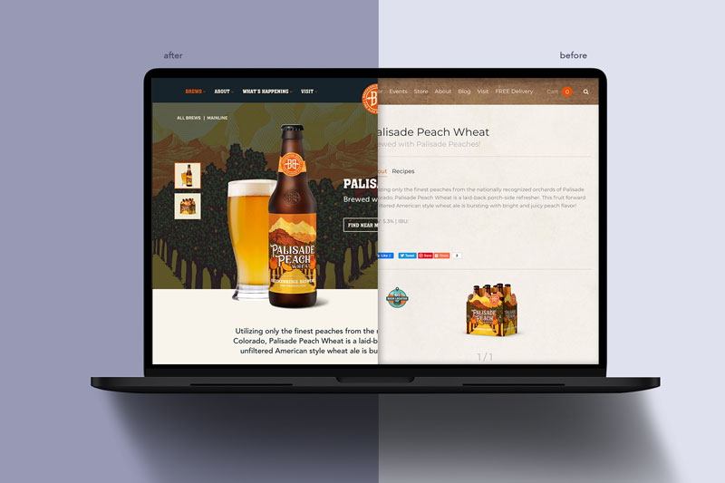
Breckenridge Brewery is the OG of Colorado craft breweries, dedicated to making brews, holding events, and creating places for the good times. What wasn’t a good time was their outdated site that needed a good UX overhaul and a new look and feel.
Breck wanted to showcase their casual, outdoor-loving natures and dedication to phenomenal brews, so we started with an in-depth audit and content strategy, where we identified user pain points, where the site was failing mobile users, and how we could create a site architecture that will scale with Breck’s ever-growing offerings.
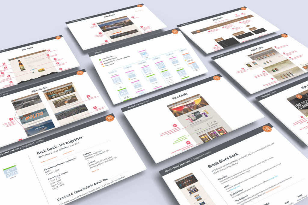
Through the content strategy, we completely overhauled the site’s UX to make it a mobile-friendly exploration zone where users can be matched to their perfect brew, attend one of Breck’s killer local events, and check out their incredible campus. Then we brought their brand to life with a new look and feel that puts the laid-back Colorado lifestyle front and center.
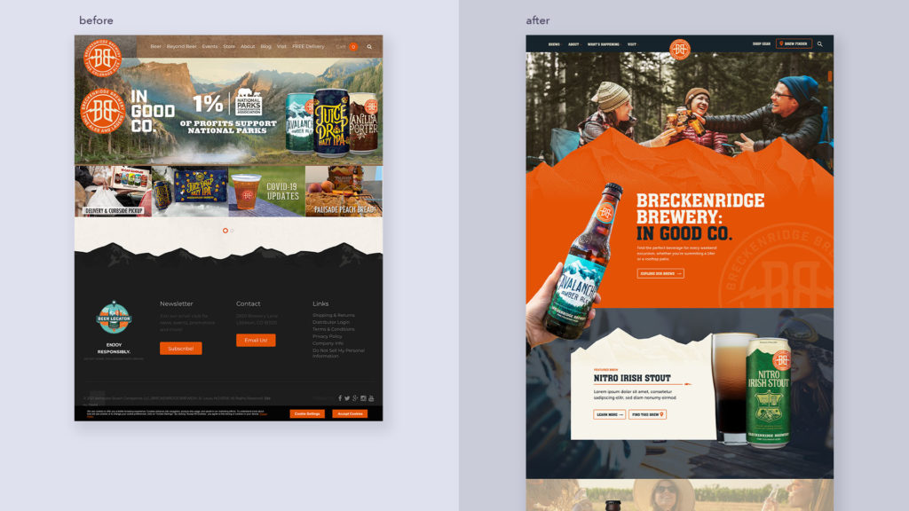
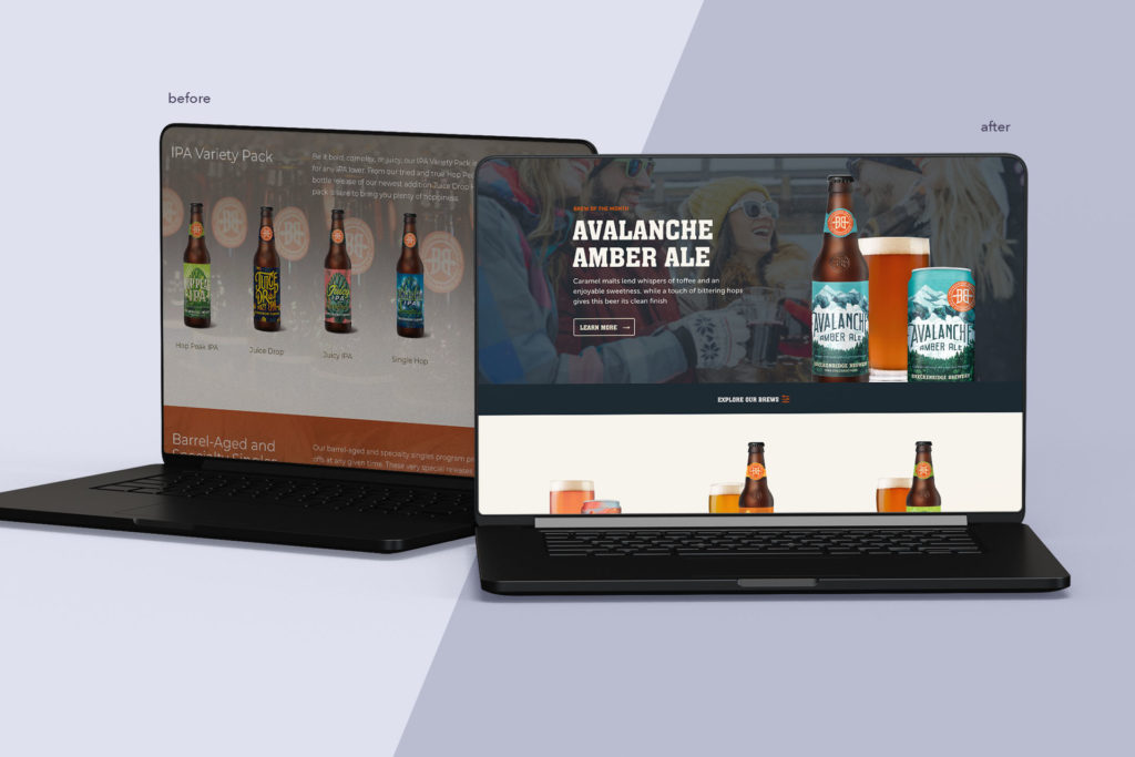
We revamped the brews page, which wasn’t categorized intuitively for users and was difficult to search and explore. The new site features an Explore Our Brews filter that lets users search by flavor profile, style, and even occasion, emphasizing the brand’s love for good times and highlights a seasonal brew.
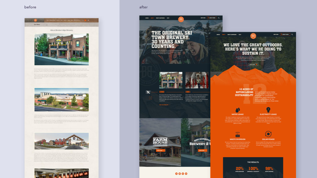
We gave a lot of love to the Breckenridge Brewery story and made sure to highlight their history as the original ski-town brewery as well as all the ways they give back to their community and take care of our planet.
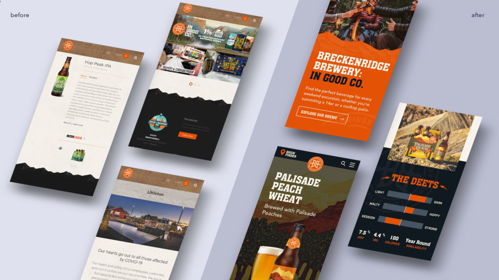
Most importantly, we created a mobile-first site that allows users to quickly search products, find where to buy, book an event, make a reservation, check out the menu, and buy tickets to events.
Check out the full Breckenridge Brewery site here and get ready for good times.
