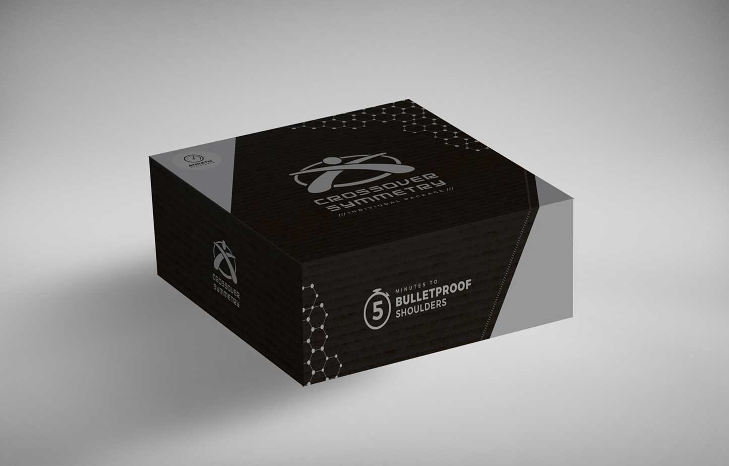
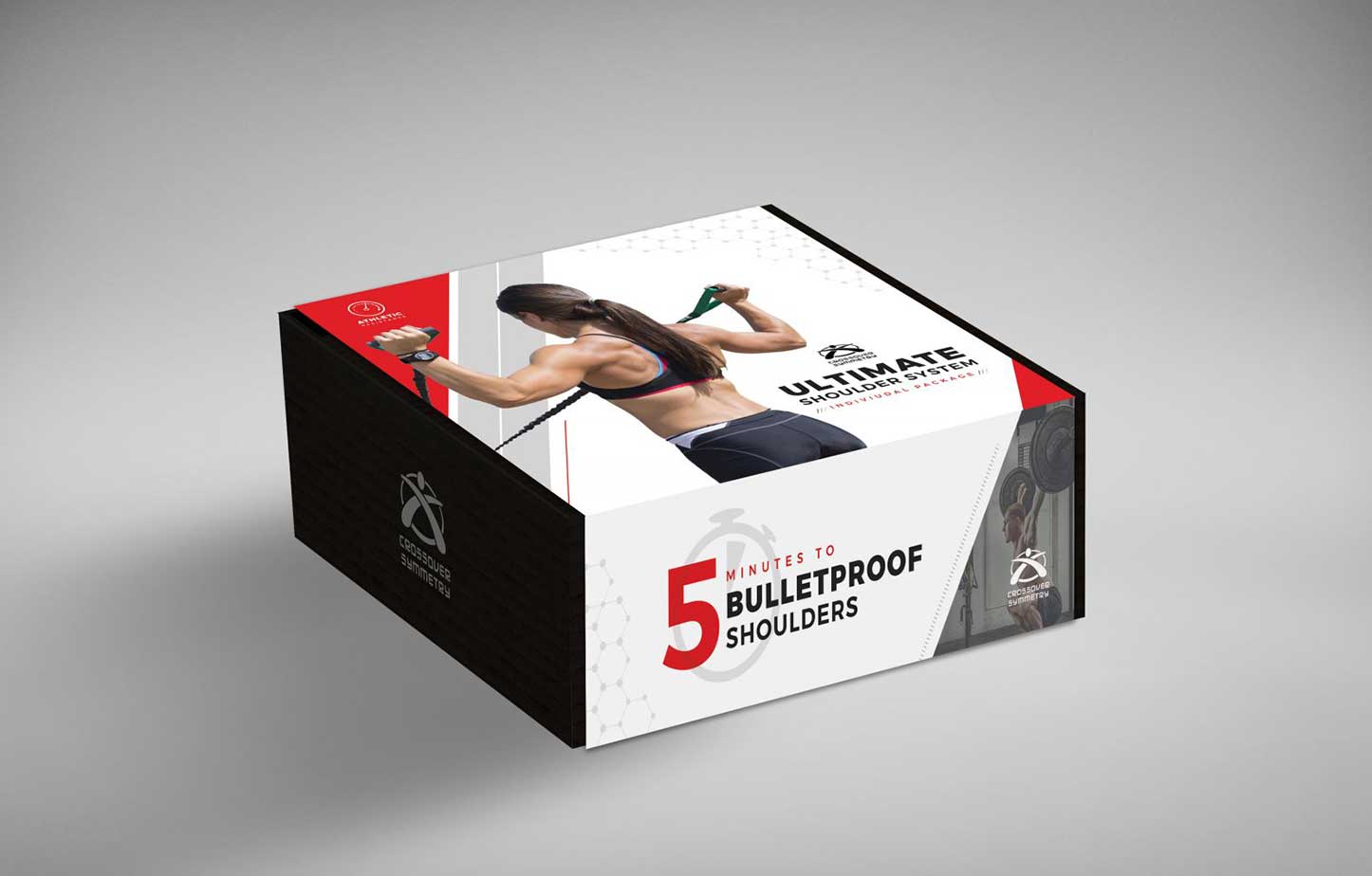
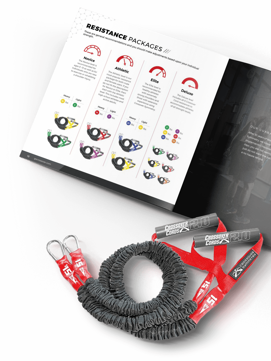
Crossover Symmetry
A pack update for a world-class system for training, rehab, and performance.
Market research
Architecture
Package design
Illustration

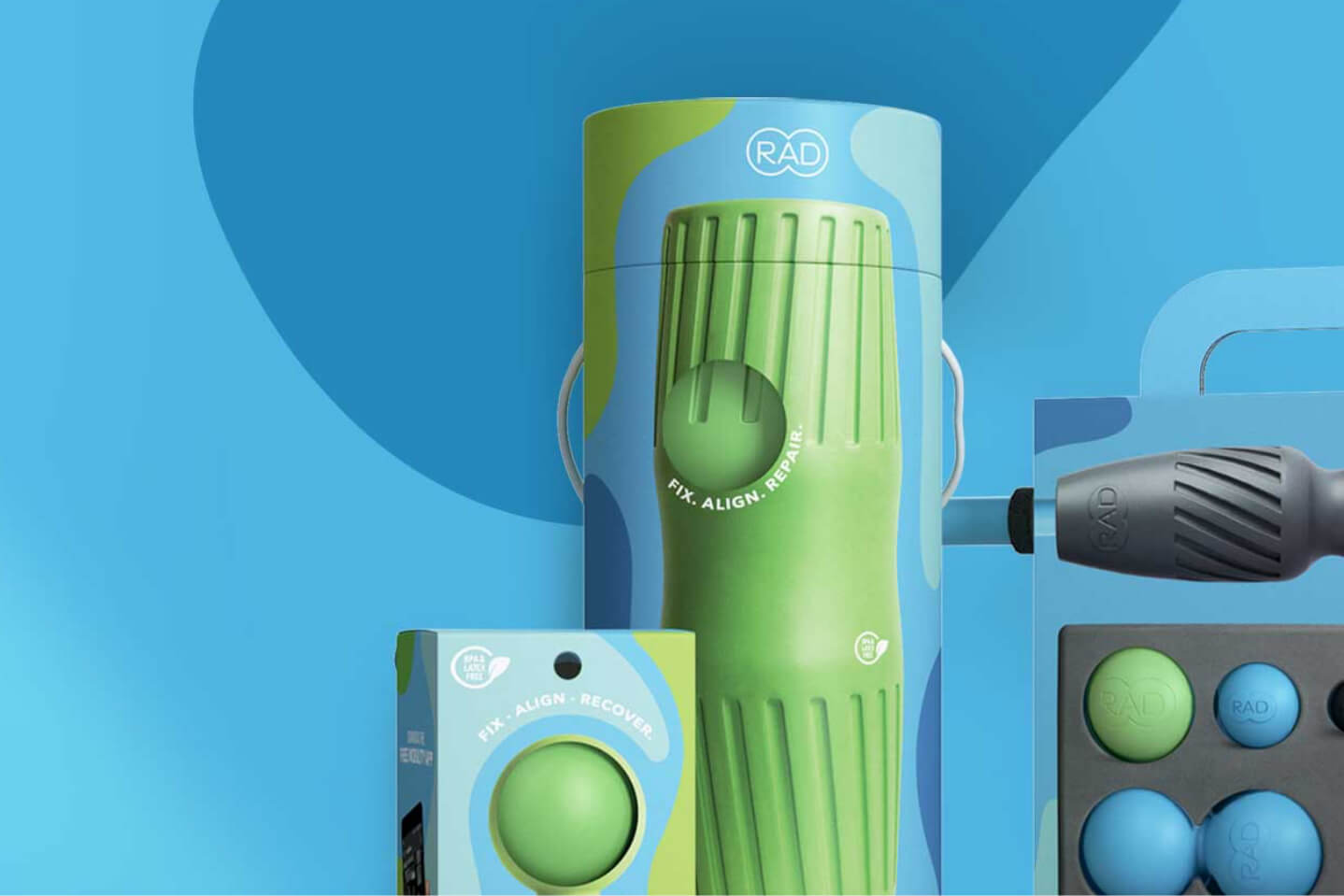
Rad recovery tools get a shelf-ready pack update.
See it now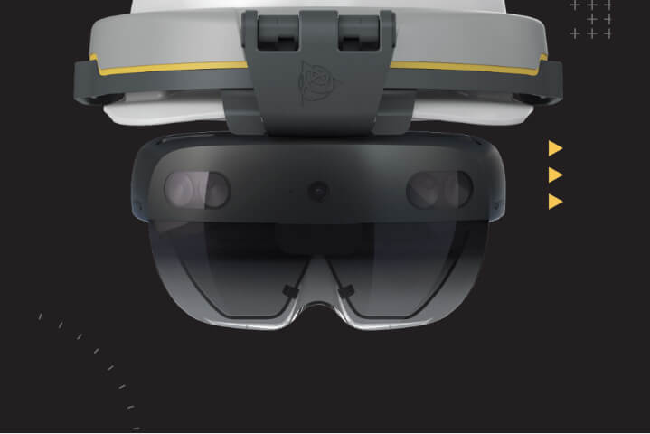
Trimble’s HoloLens gets a future-forward new pack.
See it now