Handbid Website & App

An app and marketing website for a platform that actually puts the fun in fundraising.
Website audit Content strategy Information architecture
Wireframing UX & UI Illustration
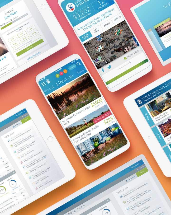
The ask.

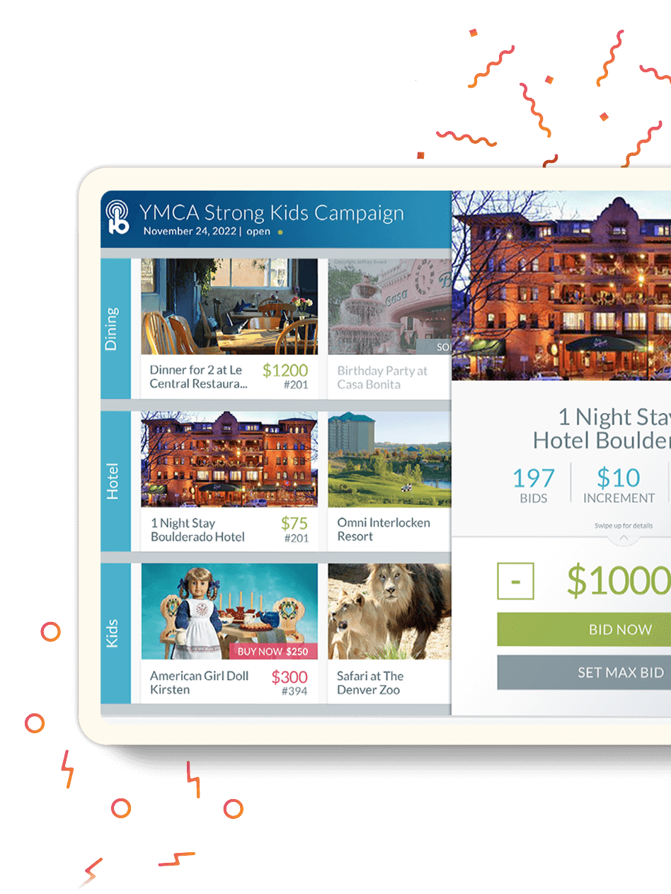
Design the user experience for a digital fundraising and auction platform so easy to use that users can bid with one hand and drink with the other.

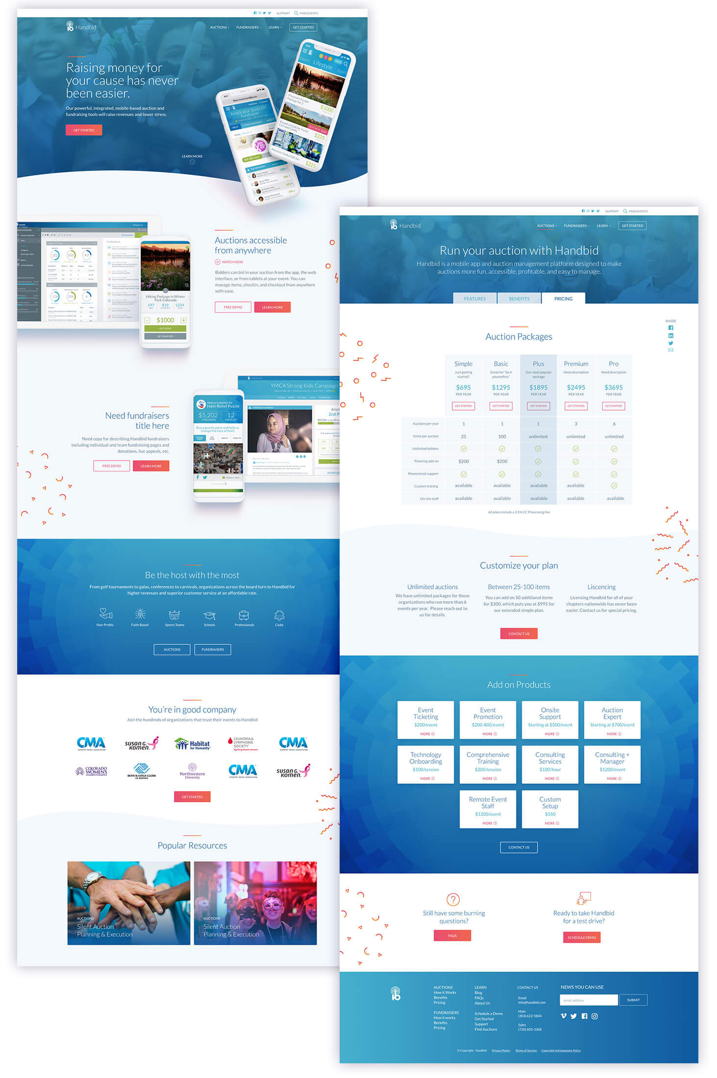
Design a corresponding marketing site that conveys how approachable Handbid’s app is for end-users and auction managers alike, and how effective it is at at increasing donations.

The solve.

We designed the user experience for the app through researched behaviors from bidders and audits of best-in-class bidding, purchasing, and browsing applications.

We created the structure of the marketing site to speak directly to auction managers with large visuals to explain the features and data to prove the benefits.

We gave both assets a bright, celebratory feel with colorful, confetti-like illustrations and vibrant gradients.
testimonial-image

Website review.

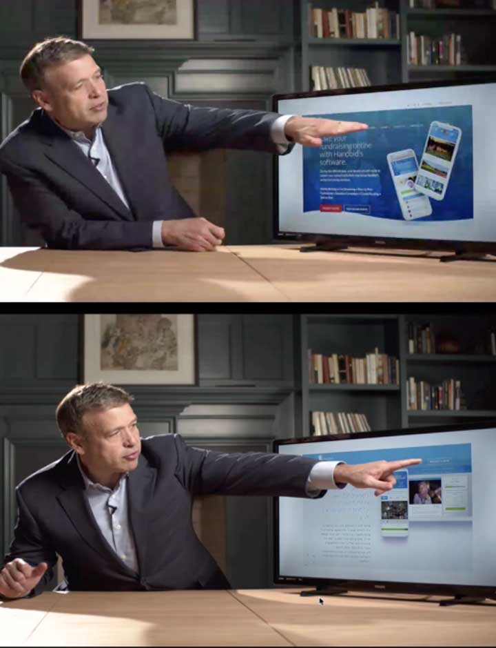
Now this is effective messaging. Handbid looks like a fantastic company with a fantastic product. Whoever you paid to design your website, great job.
Donald Miller | Author & CEO of Storybrand