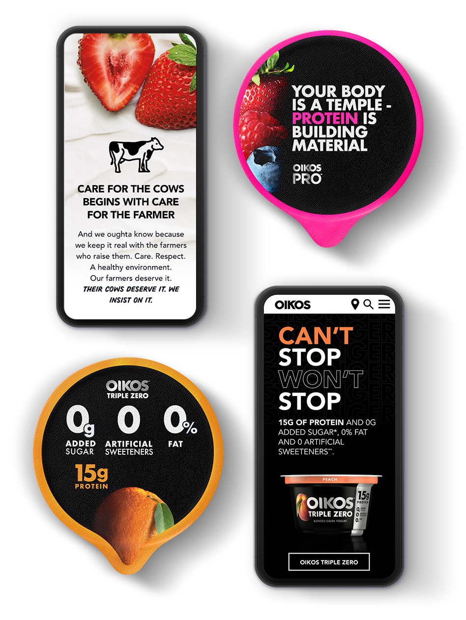
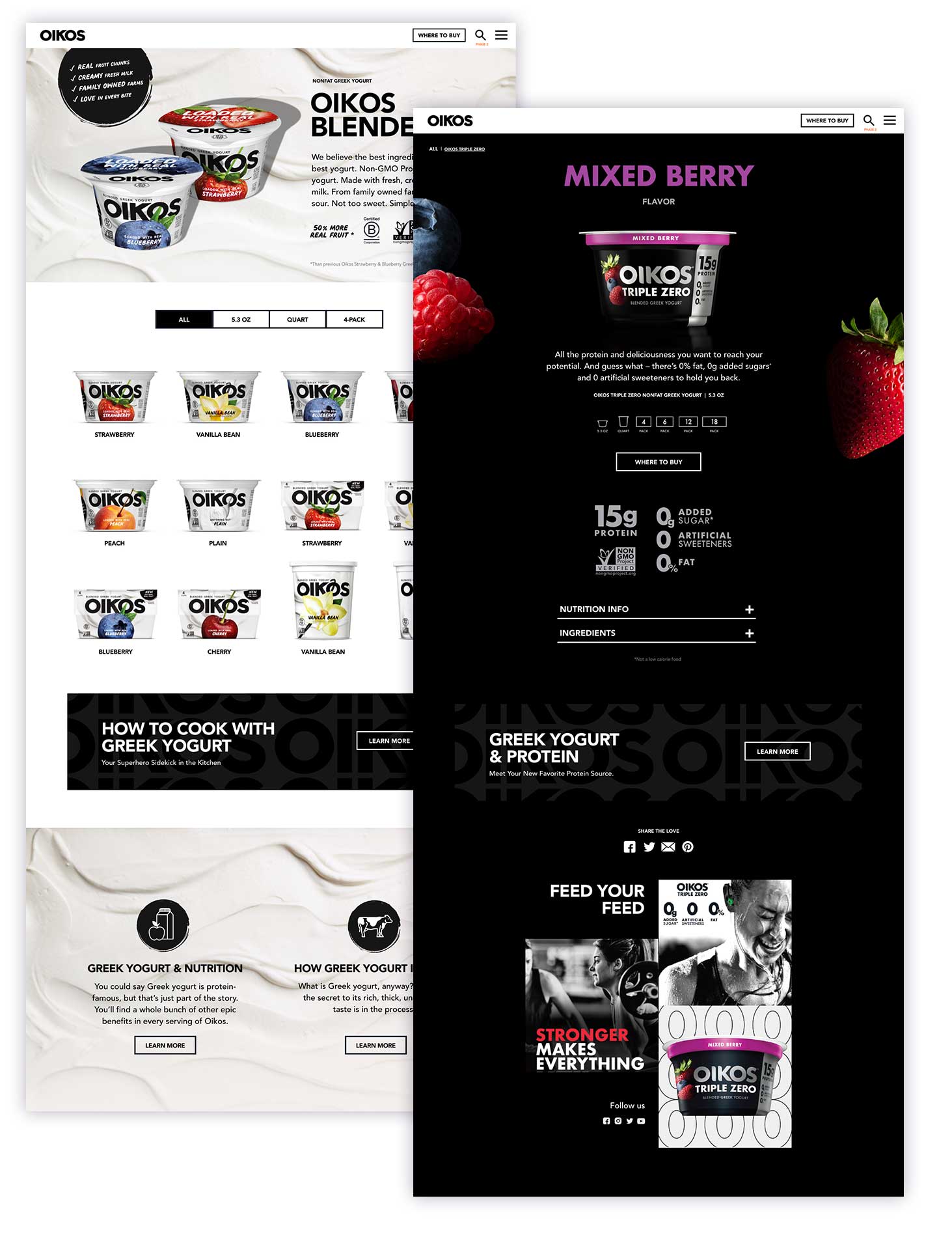
Oikos

An epically delicious yogurt brand gets a flavor-forward site to show off its bold new packaging.
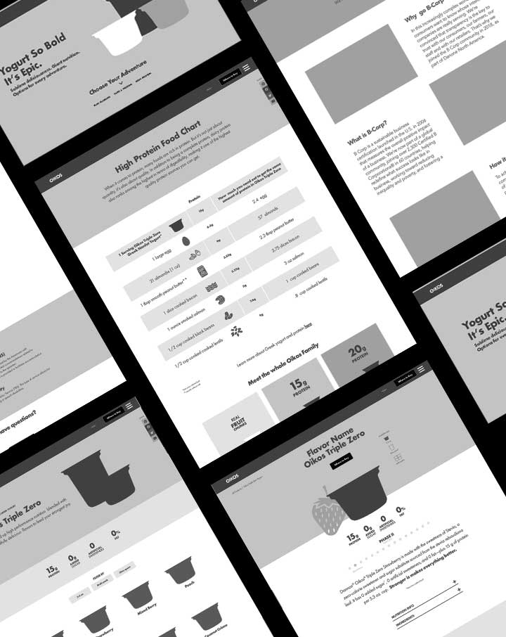
Website audit Content strategy Information architecture Wireframing UX & UI Copywriting

The ask.

Oikos recently added a new line of joy-inspiring, fruit-forward Greek yogurt to their existing protein, nutrition-controlled skus. They needed their new website to present these unique products as a united family, while helping users self-select into the product line that right for them, in addition to showing off the brand’s bold new look AND communicating Oikos’s commitment to family farms.

The solve.

It was a tall order, but we deployed several strategies to bring it all together.
We punctuated a boldly black and white color palette with enormous flavor cues and divided each product line into dark or light, with lots of guiding visual cues to help match the user to the right product line for them. We wove the story of the farmer and the product benefits strategically throughout the site.